By Paul Homewood
.
Paul Matthews uncovers the Met Office's attempt to hide its failed global temperature projections:
The Met Office have today issued their latest piece of warmest propaganda, Forecast suggests Earth's warmest period on record.
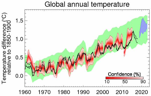
It includes this graph, showing observations (black), forecast (blue) and previous forecasts (red).

The climate scientists quoted seem to be in denial of the recent cooling shown in their own graph, claiming that the Earth's average global temperature has 'remained close' to the 2015 peak.
But notice that in the graph there is a gap from 2015-2019, with no previous forecast shown there. Why would that be? Is it because the Met Office didn't make any forecasts for that period?
Well, in fact they did. Here is the Decadal Forecast 2016 (confusingly, published in Jan 2017), which included this graph:
Full story here.
from Climate Change Skeptic Blogs via hj on Inoreader http://bit.ly/2BosQDM

No comments:
Post a Comment