By Paul Homewood
You would think Matt McGrath would get fed up with writing "we're all gonna die" articles every week! After all, most people now longer pay any attention to his incessant propaganda.

The world is in the middle of what is likely to be the warmest 10 years since records began in 1850, say scientists.
The Met Office is forecasting that temperatures for each of the next five years are likely to be 1C or more above pre-industrial levels.
In the next five years there's also a chance we'll see a year in which the average global temperature rise could be greater than 1.5C.
That's seen as a critical threshold for climate change.
If the data matches the forecast, then the decade from 2014-2023 will be the warmest in more than 150 years of record keeping.
The Met Office says that 2015 was the first year in which the global annual average surface temperature reached 1C above the pre-industrial level, which is generally taken to mean the temperatures between 1850 and 1900.
Each year since then, the global average has hovered close to or above the 1C mark. Now, the Met Office says that trend is likely to continue or increase over the next five years.
https://www.bbc.co.uk/news/science-environment-47144058#comment_133613579
In true BBC fashion, however, there are a lot of things that McGrath forgot to tell us, which would show that things aren't quite as black and white as he would like you to think.
Let's start with that fake map:
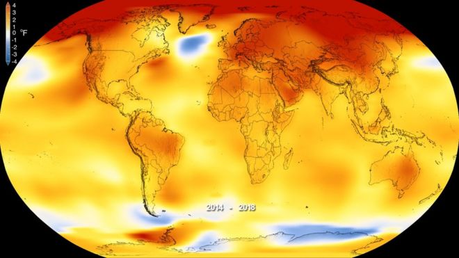
This claims to represent temperature anomalies, calculated against a baseline of 1951-80, three of the coldest decades of the entire 20thC.
In reality, however, there is no temperature data whatsoever for vast areas of the world, and NASA, who published the map, simply make up temperatures to fill the missing gaps (grey below).

https://www.ncdc.noaa.gov/temp-and-precip/global-maps/
Note also that red swathe across the Arctic, intended to persuade us it is burning up there.
NASA, NOAA and the Met Office have virtually no data at all anywhere in the Arctic Circle, other than a tiny handful of sites around the edge, at least some of which are affected by UHI. It is scientifically well accepted that you cannot use these land sites to derive surface temperatures across the ice filled Arctic Ocean. Yet that is exactly what NASA and co do.
But let's take a look at the longer term trends in Arctic temperatures, according to the Met Office Hadley Centre. Bear in mind that 1951-80 baseline that NASA and the BBC are trying to persuade you is the norm.

As you can see, temperatures back in the 1930s and 40s were similar to now, but declined sharply in the 1960s and 70s. We keep being told that Arctic temperatures are rising faster than the rest of the world because of global warming. But the rapid rise since 1980 is nothing more than a cyclical phenomenon.
In contrast to the sparse surface coverage, satellite data offers a much more complete picture of atmospheric temperatures. And these show that the temperature last year was nowhere near being a record , and was barely higher than 2002.
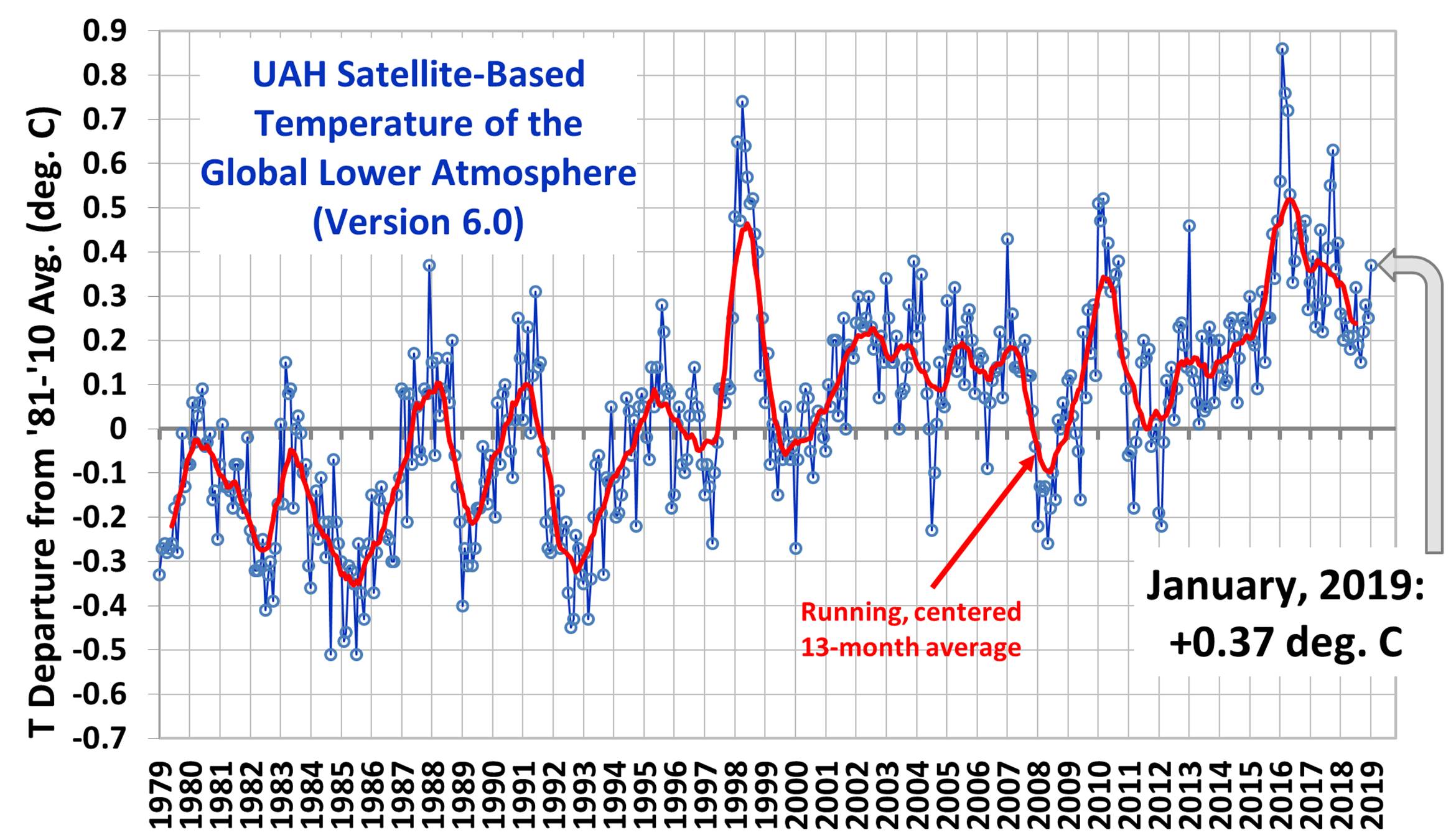
http://www.drroyspencer.com/latest-global-temperatures/

https://www.nsstc.uah.edu/data/msu/v6.0/tlt/uahncdc_lt_6.0.txt
Those, for whom the UAH data is somewhat inconvenient, try to argue that you cannot compare tropospheric temperatures with surface ones, as it is like comparing chalk and cheese.
However, this was very definitely not what was being said a few years ago, when the two datasets were in broad agreement. For instance, this was what IPCC AR4 had to say in 2007:
For global observations since the late 1950s, the most recent versions of all available data sets show that the troposphere has warmed at a slightly greater rate than the surface, while the stratosphere has cooled markedly since 1979. This is in accord with physical expectations and most model results, which demonstrate the role of increasing greenhouse gases in tropospheric warming and stratospheric cooling; ozone depletion also contributes substantially to stratospheric cooling.
http://www.ipcc.ch/publications_and_data/ar4/wg1/en/faq-3-1.html
In other words, it was well accepted that tropospheric and surface temperature trends should track each other over time.
Defenders of the surface record point out that the various versions tend to agree closely. However, this means little, other than the fact that they all tend to rely on the same data, and that there is a lot of collusion.
Take a look at the chart below.
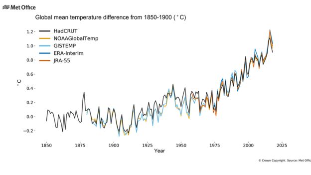
There is very close agreement in the 19th and early 20thC. Yet there was barely any temperature data at all in those days.
It would have been statistically impossible to derive a global temperature from such little data, yet somehow the Hadley Centre, NOAA and NASA all managed to work it out to great detail, and each came to similar results. Coincidence?

http://journals.ametsoc.org/doi/full/10.1175/JTECH-D-11-00103.1
Another trick played by the alarmists, and eagerly echoed by the BBC, is to keep quiet about margins of error.
As already noted, there are absolutely massive uncertainties about the calculation of global surface temperatures, concerning coverage, sampling, measurement, UHI and other biases. The Hadley Centre attempt to measure this uncertainty, as I have shown below:

For instance, although the estimated anomaly for 2018 was 0.596C (compared to a 1961-90 baseline), the actual range could be anywhere between 0.509 and 0.685C.
In my opinion, the real level of uncertainty is far greater than admitted. But even on these figures, we can see that statistically 2018 is only tied with years such as 2001. Apart from the record El Nino of 2015/16, there is no evidence statistically that global temperatures have gone up since 1998.
When we hear claims of hottest evah, we need to keep in mind that they are based on differences of hundredths of degrees, amounts so small that they cannot even be measured.
Pre Industrial
You may have noticed that, increasingly, reports of global temperatures always seem to talk in terms of warming since pre-industrial times, defined as 1850 to 1900.
This did not use to be the case. NASA, NOAA and the Hadley Centre all used to report on the anomaly values, sometimes converting to an actual temperature.
The predominant use of the rise since pre-industrial stems from the "2C" target formalised at Paris.
And the reason is very clear. From a PR point of view, it sounds much more scary.
For instance, measured in terms of anomaly from 1981-2010, last years HADCRUT temperature was 0.3C. That would be unlikely to frighten anybody, particularly when it is an impossible job to measure global temperatures to such a degree of accuracy.
Moreover, people know full well that their own local temperatures can vary by much more than that on a daily basis.
To sell the scare to the public, the numbers needed to be beefed up. Hence talk of 1.5C and 2.0C.
The fact that we have already, supposedly, has a full degree of warming since the 19thC, without any deterioration in climate, is neither here nor there. People need to be scared.
Yet whenever the BBC or the rest of the media broadcast the latest propaganda, they never seem to mention that the 19th was the end of the Little Ice Age, arguably the coldest era since the Ice Age.
I have yet to hear anybody seriously argue that it would be good to return to those cold days of the past. Even Matt McGrath!
from Climate Change Skeptic Blogs via hj on Inoreader http://bit.ly/2BtthNg


No comments:
Post a Comment